An analytics solution, built only for you.
A custom solution around your numbers, your questions and your look - built in a bespoke interface, or in Power BI / Tableau if you prefer. And it stays yours.
Not a tool you rent
We don't hand you a generic dashboard. We build a solution shaped entirely around your business - no per-seat fees, no lock-in.
Answers, not just charts
Every view is designed around a decision you actually make - so the numbers always lead somewhere.
Everything, done properly.
Dozens of manual reports, now running on their own.
Drivo is a car-rental company. Their reporting was built on spreadsheets and the people who filled them in. We replaced that with one platform that reads their systems, assembles the reports and sends them out on its own.
Everything by hand
Reports were assembled in Excel by a large group of people. It took most of their day, and every manual step was another chance to get a number wrong. Once a report was finished, someone still had to email it to the right people, also by hand.
- A large group of people on it every day
- Numbers copied between files by hand
- Every report emailed out manually, one by one
One platform in the middle
We connected to their CRM and built a custom platform on top of it, shaped around how Drivo actually works. It became the bridge between the database, the report and the person who needs it.
- Their other systems come in through the same platform: fleet, tolls and the rest of the third-party services they run on
- Power BI was used for output, then brought inside the platform so everything sits in one interface
- An HR panel that composes flexible schedules on its own, sends them for approval and handles shifts and lateness
The reports run themselves
Dozens of daily, weekly and monthly reports that used to be assembled by hand now prepare and send themselves. The manual work taken out is measured in tens of hours a week.
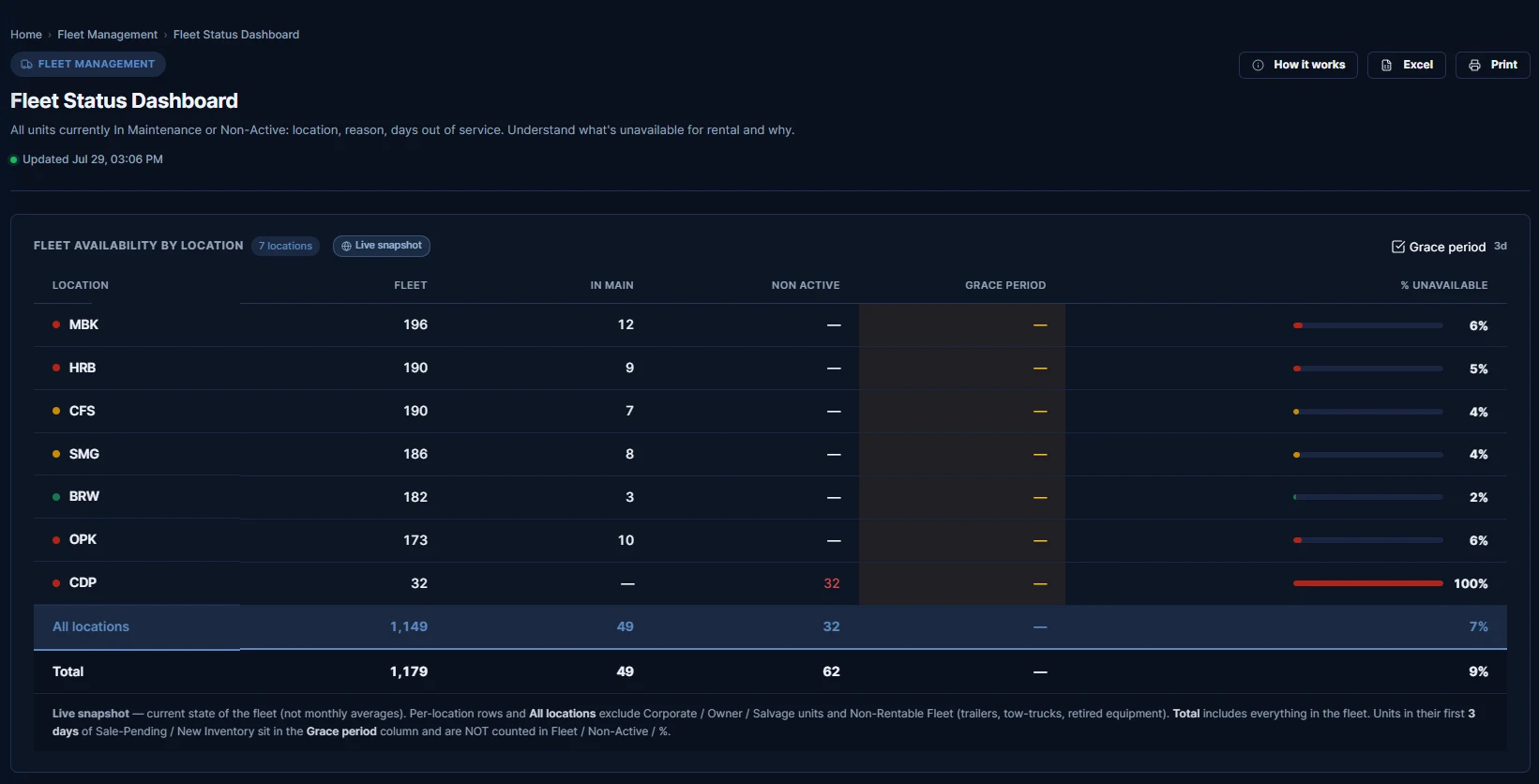
- One fleet report alone took an hour to an hour and a half every single day. It is fully automated now
- The whole upper management works in it, the CEO included, going straight to the numbers instead of asking someone for them
- Everyone has their own access level and their own metrics on screen
- Manual copying between files is gone, and so are the mistakes that came with it
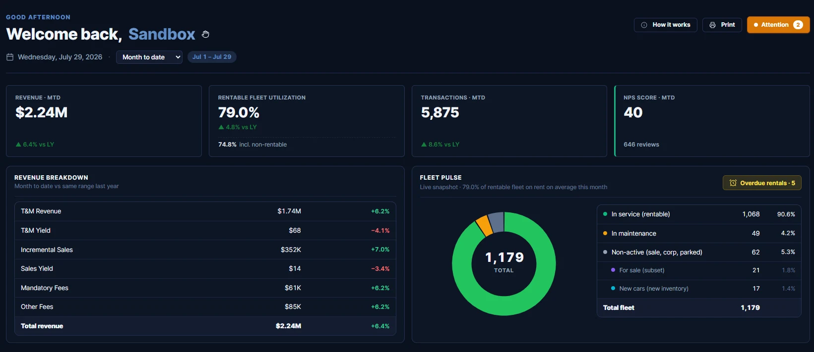
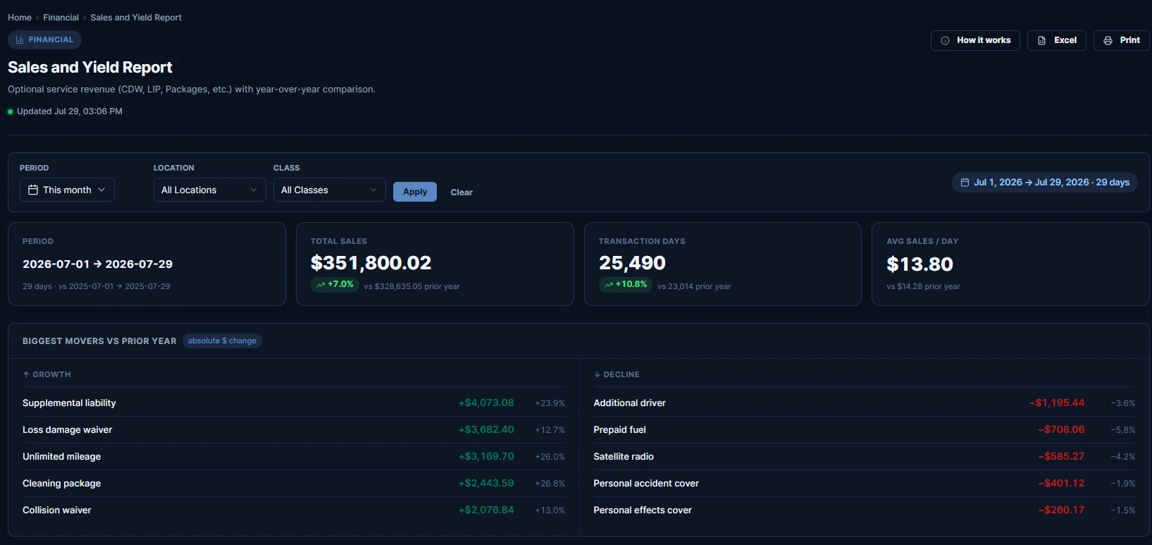
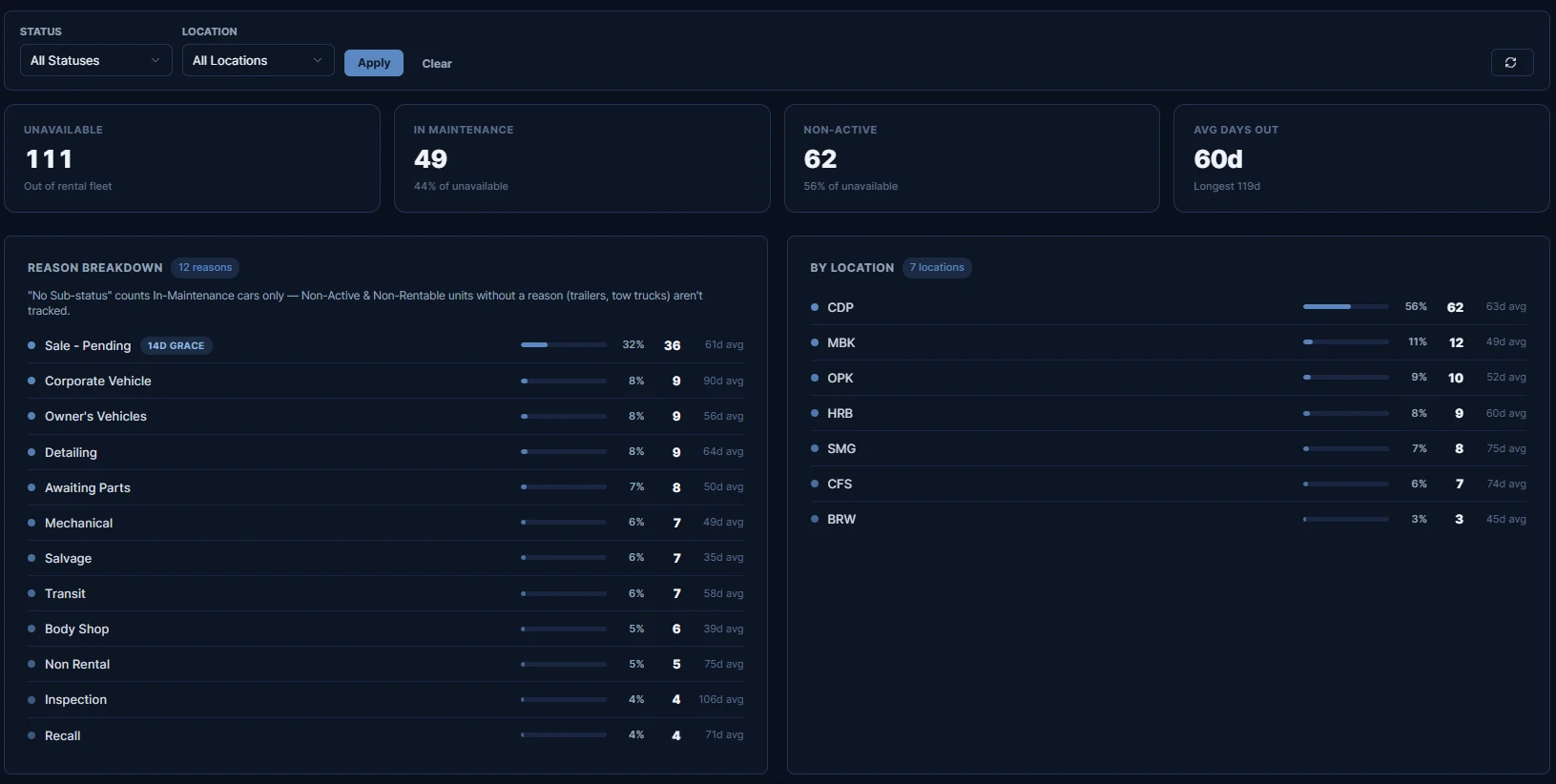
The screens the team opens every morning.
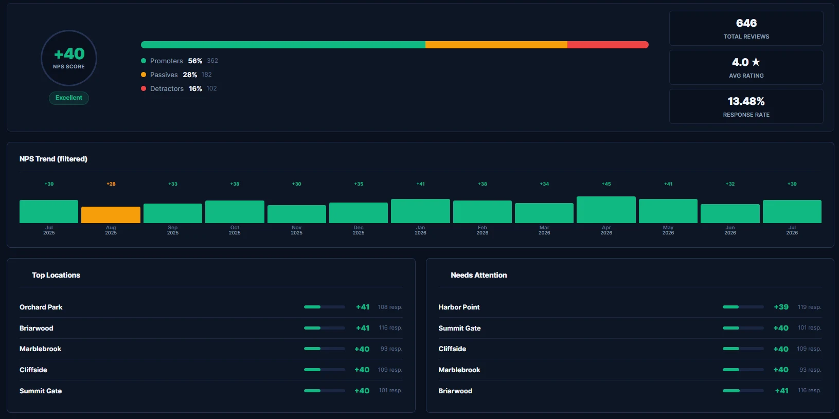
This is the platform built for Drivo, running on a sandbox copy so we can show it. The layouts are exactly what they use.
Every number, name, location and vehicle in these screenshots is invented seed data from a sandbox account. Nothing here is a real Drivo figure. The interface is real — the data is not.